Specialist Chiropractor in Colchester
The website looks and works great. We are getting a lot of positive feedback from our regular patients about the new booking system. Really pleased with the overall results.
 Robert Bateman · Bateman Chiropractic
In April 2025, organic traffic surpassed paid traffic for the first time since the website was built back in 2019. Engagement is up and bounce rates have almost halved within 6 months.
Several foundational issues were identified during our website audit that went beyond visual design or branding. Key findings included:
When we first spoke with Rob at Bateman Chiropractic, it was clear something wasn’t adding up. Their Google ads were performing well, showing a strong 9% conversion rate, yet the clinic wasn’t seeing the volume of bookings to match.
A closer look revealed that 85% of their traffic was coming from paid channels and just 15% from organic search. Regardless of how visitors found the site, they behaved the same way, they didn’t stay long. In fact, more than 80% of visitors were leaving within seconds, without interacting at all.
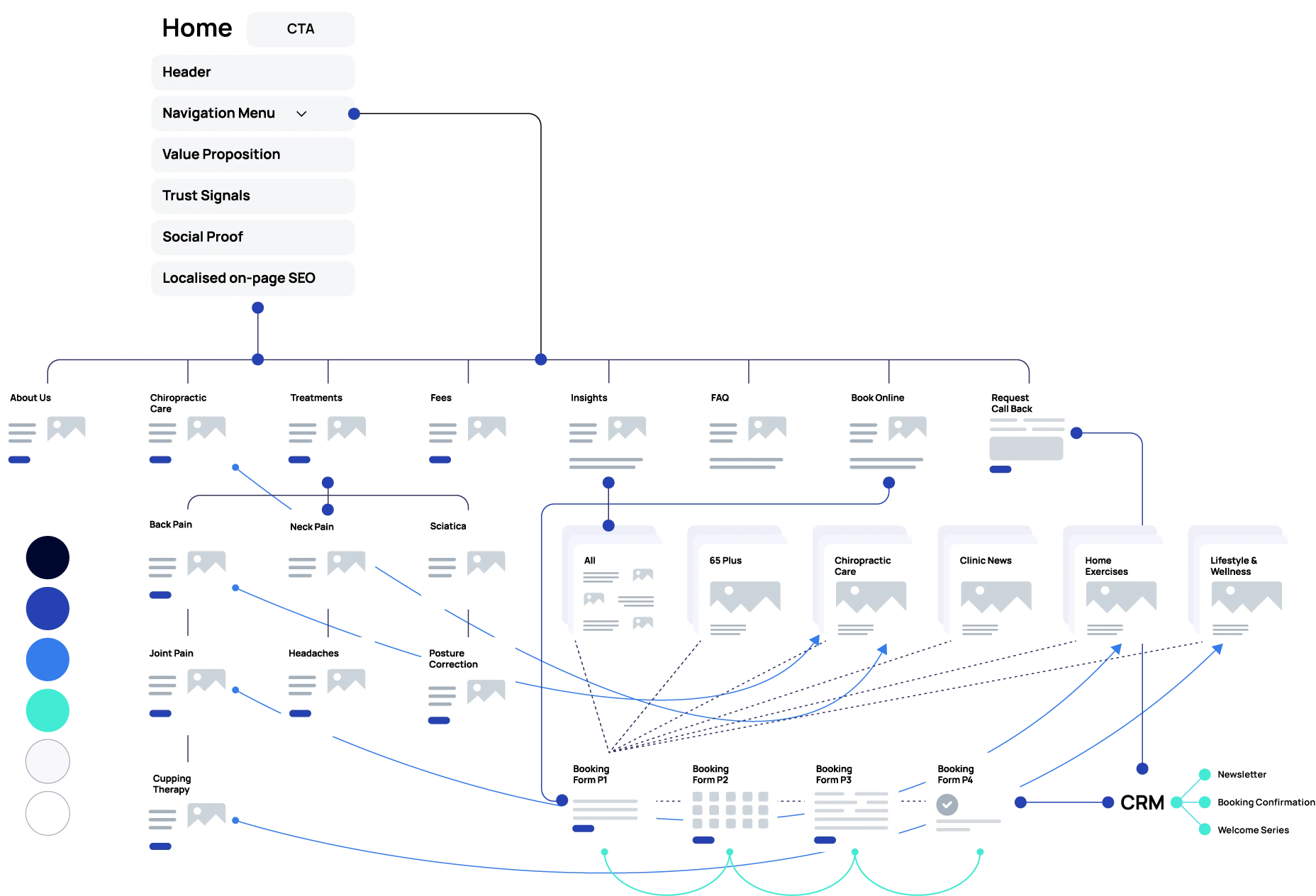
Creating a sitemap was the first step in our redesign process. This allowed us to map out the content structure from the ground up, define key page types and identify how internal links could be used more effectively to support navigation and relevance.
It also gave us a clear framework for aligning content with user needs and ensuring the new design would be both purposeful and scalable.
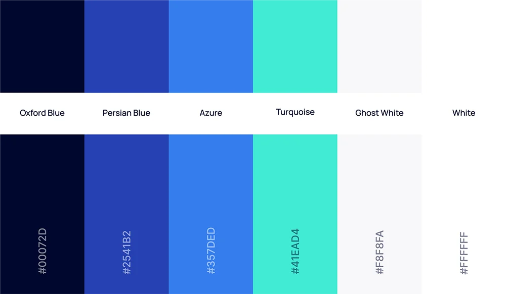
The website’s original orange tones were replaced with calming shades of blue, creating a fresh and professional aesthetic.
Blue enhances readability, fosters trust and tranquillity and better reflects the clinic’s commitment to health and wellbeing.
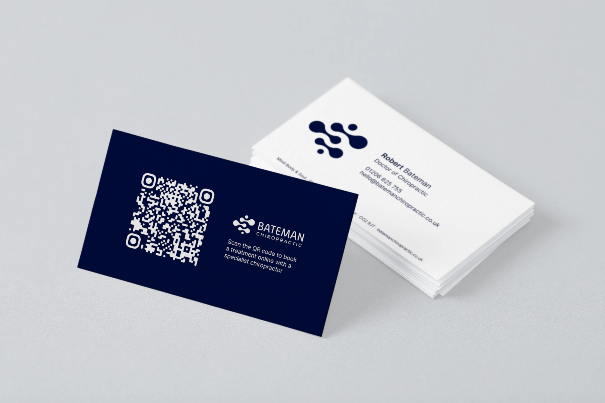
The original logo featured just the name, which focused more on the individual than the business as a whole. While it hinted at the service offered, it lacked clarity and consistency across brand touchpoints.
We introduced a modernised logo using the full business name to present a more professional and established presence.
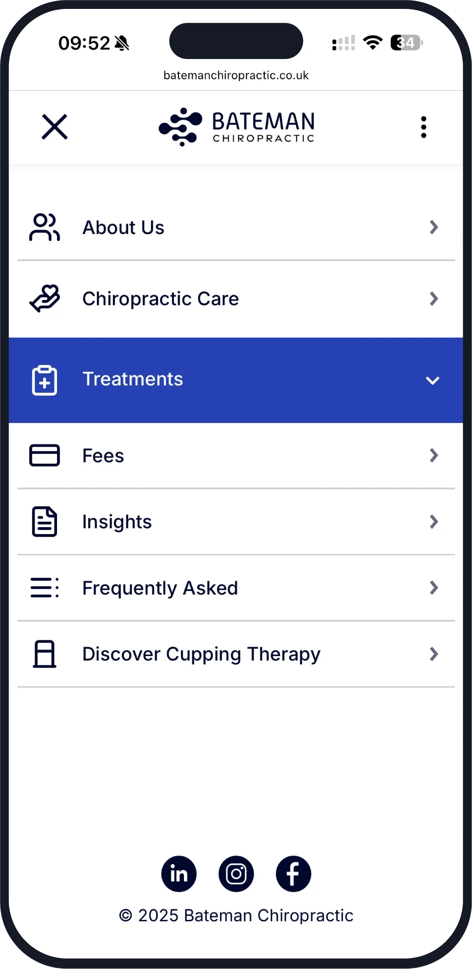
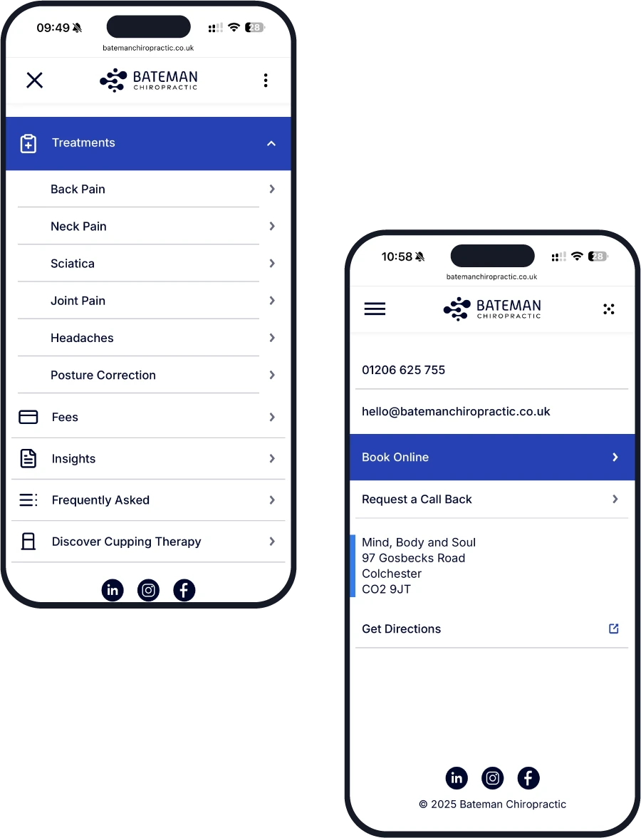
We redesigned the menu to offer a seamless browsing experience for visitors, allowing them to quickly access essential information such as treatments, contact & booking options and clinic details.
With improved organisation and clearer navigation, users can find what they need in fewer clicks, enhancing their overall experience on the site. The intuitive layout ensures everything is just a few taps away.
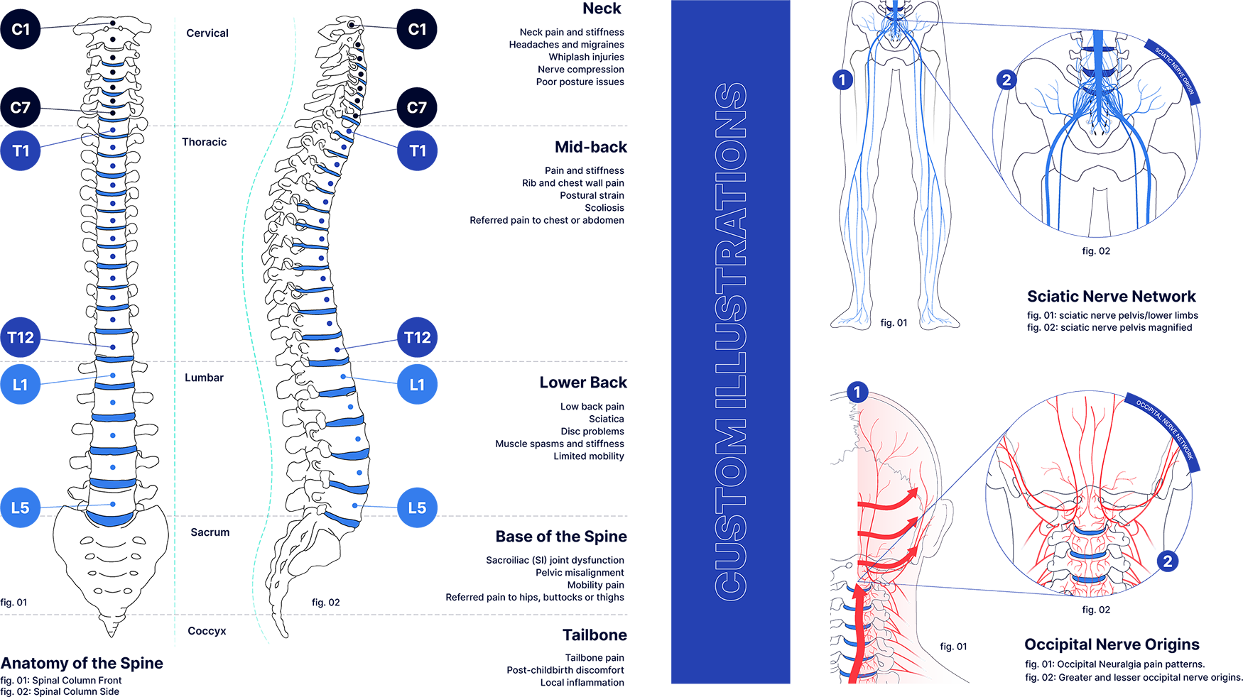
We created illustrations and icons that genuinely felt like an extension of their practice. Each design took inspiration from the day-to-day world of chiropractic care, so nothing felt generic or off the shelf.
The end result is a collection of visuals that not only look great, but also help Bateman connect with clients and share what makes their approach unique.
Every great result begins with a conversation
Share your ideas and goals with us. We’ll listen, ask the right questions and guide you towards what makes sense for your project.
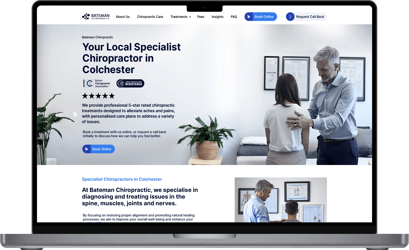
We designed every element of the homepage to engage visitors from the start, prioritising clear messaging, local relevance, trust signals and clear calls-to-action above the fold.
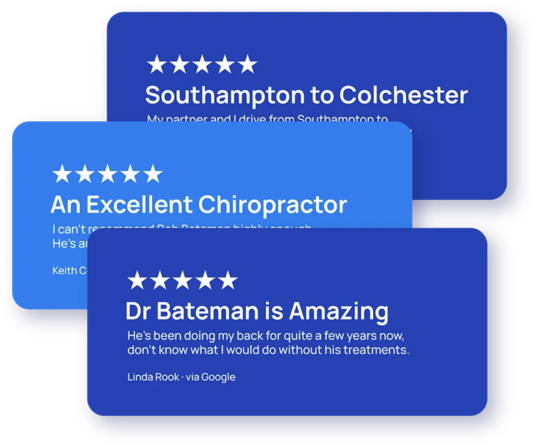
We strategically added testimonials and social proof throughout the site to help reassure new patients at every stage of their journey.
Start a conversation with us on our WhatsApp business channel or send us your details online, whichever suits you best.
Prefer to call us?
We typically respond within 10 minutes, however there may be a delayed response outside of our normal working hours
(Mon-Fri 9am-6pm).